Clemson DSP
My role Director of IT; public site design and development
I rebuilt our public chapter website to put the people, projects, and personality of Kappa Tau first.
I’m a Clemson Management student with an Information Systems emphasis. I like figuring out why something is frustrating, then building a better version. So far, that’s meant an AI tool for DECA, the public website for Delta Sigma Pi, and a lot of things I’ve built with AI along the way.
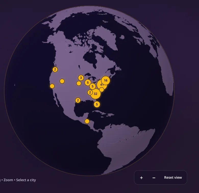
Where we're from.
See it live at clemsondsp.com
Washington DECA members reached through Decaverse
people able to trade in one stock market simulation
International Impact Award for Innovation
Five projects I keep coming back to. Open a folder or scroll through the work.
My role Director of IT; public site design and development
I rebuilt our public chapter website to put the people, projects, and personality of Kappa Tau first.
My role Concept, content, UX and prototype
An interactive fundraising plan that makes events, estimates, and the goal easy to understand.
An AI-powered practice tool for DECA competitors, built from a problem I knew firsthand.
My role Designer and developer
A stock market game built so thirty people could learn by making their own trades.
A finished, usable planner for keeping assignments, chapter work, and everything else in one place.
Most of my projects start with: “Wait, why do we do it like that?”
I'm from Bellevue, Washington, and now study Management, with an Information Systems emphasis, at Clemson. I'm minoring in Brand Communications because I like working on both sides of a product: how it looks, and whether it makes sense to the person using it.
I started building tech for DECA competitions in high school. Now, as Director of IT for Delta Sigma Pi, I get to make real things for people I see every week. Sometimes it's a website. Sometimes it's a side project I couldn't stop thinking about.
I'm still learning. The part I enjoy most is having an idea, finding the awkward parts, and making the next version better.
Some of my best work started with roles I already had, then turned into projects I wanted to build.
Management major with an Information Systems emphasis and a Brand Communications minor. Expected graduation: 2029.
Rebuilt our public website, searchable brother directory, rotating photo gallery, and interactive homepage details.
Helped customers in Bellevue find what they actually needed, and regularly met $3,000 daily sales goals.
Built an AI-driven competition-prep tool for Washington DECA. Recognized with a 2025 International Impact Award for Innovation.
Gave student testimony for Senate Bill 5080, which pushes for financial literacy in Washington high schools, and worked with senators and other student advocates on the message.
Served on the state officer team and helped host state conferences for about 10,000 students. That work is where I saw the need that became Decaverse.
I’m looking for opportunities in UX, product, and technology. If something here caught your eye, I’d love to talk about it.
I rebuilt clemsondsp.com for Delta Sigma Pi's Kappa Tau chapter. I wanted someone visiting for the first time to see the people behind the letters, find the information they needed, and have a reason to keep exploring.
Where we're from.
Someone thinking about joining DSP wants more than a description of the organization. They want to see who's there, what the chapter spends time doing, and whether they could picture themselves being part of it.
I wanted the public website to do that without burying useful information. Photos needed room to breathe. The brother directory had to be easy to search. And the interactive pieces had to give visitors something worth exploring, not just something flashy.
Use candid photos of brothers rather than relying on generic stock images or formal headshots everywhere.
Build a searchable brother directory, with clear class filters and a way to get to know the members.
Bring the company marquee and interactive ‘Where We’re From’ globe into the homepage as part of the same experience.
A conventional chapter site where the personality of the people could get lost among the information.
A photo-led public website with a searchable directory, real chapter moments, and interactive details built into the same design.
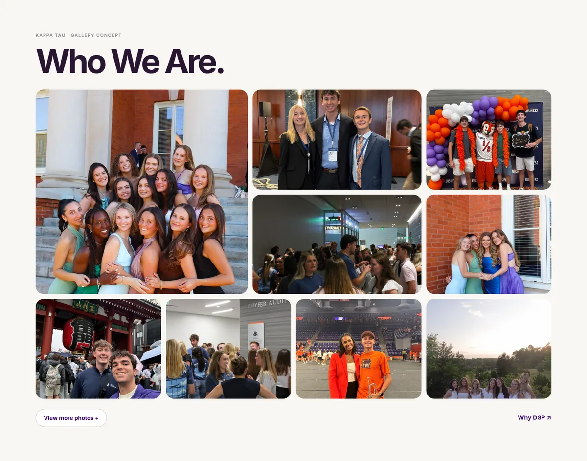
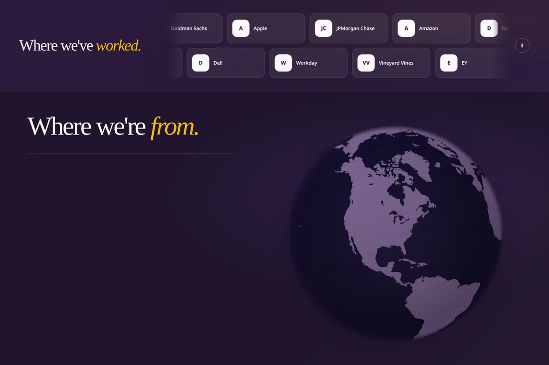
The rebuilt public site is live at clemsondsp.com. The brother directory, photo gallery, animated company marquee, and ‘Where We’re From’ globe are all part of that single website. I keep refining the details as the chapter grows.
It doesn't take a giant paragraph to show what a community feels like. Sometimes a great photo and an easy way to explore are more convincing.
The globe is still one of my favorite parts. Visitors can spin it to see the places connected to our brothers, with locations grouped instead of showing individual home addresses. It belongs inside the larger website story, not as a separate project.
For my Delta Sigma Pi financial development application, I didn't want to hand over another list of events. I wanted people to see the plan, understand the tradeoffs, and know where the money could come from.
Good ideas.
Clear numbers.
A bouquet bar, a proceeds night, and a March Madness bracket have different audiences, different logistics, and different profit potential. Without a clear place to compare them, the plan feels larger and more complicated than it is.
I started with plenty of options, then realized there were too many. The project became as much about editing as adding. I needed the site to communicate variety without making the chapter feel like it had fourteen events to run.
Use a visible fundraising target of approximately $2,000, separated from projected event profit.
Reduce the event list and remove options that made the schedule feel overloaded.
Use simple event descriptions so brothers can picture actually going, not just see a projected total.
A long set of event ideas and estimated earnings with no clear way to compare the plan.
One explorable website with the target, event concepts, and an easier read on the mix of activities.
The Figma site is published as an interactive proposal. It shows how I would communicate the plan, not verified income, approved events, or a finished fundraising campaign. The $2,000 figure is a target.
The biggest improvement came when I took events out. UX is not always another feature. Sometimes it's knowing what not to ask people to sort through.
The design leans into Delta Sigma Pi purple and gold, but uses enough space and contrast for the estimates and event descriptions to stay readable.
I competed in DECA for years. I knew how much time went into studying, and how quickly the available practice materials could start to feel like a pile of disconnected PDFs. So I built Decaverse to make that practice easier to get into.
Which approach builds stronger customer relationships over time?
Students had exam material, but turning it into a useful study session took effort. A great tool could help competitors choose what to practice and stay in the flow instead of spending their energy just finding questions.
I developed the core tutoring experience independently and worked with the Washington DECA state officer team around its rollout and award presentation. I cared about creating something other students would reach for before their competitions.
Help students practice for competitive exams, not chat with a general-purpose assistant.
Ground the experience in archived DECA testing and competition-prep material.
Make the tutoring experience accessible to members without asking chapters to adopt a complicated new workflow.
Static practice materials that students had to organize and work through on their own.
A focused AI-powered preparation experience built around competition practice.
Decaverse reached more than 17,000 Washington DECA members and was recognized with the 2025 International Impact Award for Innovation. Washington DECA's 2024-25 impact report documents the state team's Decaverse initiative. The app is closed-source, so I'm linking the published report instead of pretending a public demo exists.
This project changed how I think about digital tools. The technology matters, but removing the tiny bits of friction around someone's actual goal matters just as much.
The practice screen pictured here is an illustrative portfolio reconstruction rather than a production screenshot.
It's hard to make a lecture about investing feel immediate. I built a multiplayer stock market simulation for Delta Sigma Pi so everyone in the room could make decisions and see what happened.
Everyone gets to trade.
A slide can explain a stock trade. It cannot recreate the part where someone has to choose. I wanted a low-pressure environment where each person had something to do, not just something to look at.
The challenge was making a live group experience simple. Thirty people needed to join, find the same information, place trades, and keep following the session without the interface getting in the way.
Support thirty concurrent players instead of designing for a single-person demo.
Use ten rounds of fictional market news to make every trading decision matter.
Use a clear portfolio view and simple trading flow so participants can discuss choices.
A lesson where participants could only discuss imaginary investing decisions.
An interactive market session with individual simulated portfolios and trading.
The current public demo supports up to thirty players, fictional $10,000 starting portfolios, six simulated stocks, and ten host-controlled market rounds. It is an educational activity, not a real-money trading platform. The host controls when rounds begin and advance.
The best feature was getting everyone into the activity. If onboarding takes too long, the entire idea stops being fun.
Any chart or portfolio visualization shown on this page is illustrative, not a real participant balance.
My assignments, classes, and Delta Sigma Pi tasks were spread across too many tabs. I built a planner that keeps my actual to-do list easy to scan, and it’s now a finished, usable app.
one thing at a time.
today ↗The first versions had large task cards and too many future deadlines on screen. More information was not making me more organized. It just made the page harder to scan.
I kept tightening the layout based on how I use it: smaller task rows, progress states I can adjust, and a way to hide assignments more than two weeks away until I need them.
Show a compact list of what needs attention without oversized cards.
Let each task have its own in-progress state and completion slider.
Tuck tasks beyond the next two weeks behind a disclosure instead of filling the first screen.
Tall task cards, lots of future deadlines, and too many competing elements.
A focused list of near-term work, with progress details when you need them.
Pastel Planner is complete and usable, not a concept waiting to be built. It brings my assignments and other tasks into a compact view, with adjustable progress and a way to keep far-off deadlines out of sight until I need them.
The two-week cutoff made the biggest difference. Seeing fewer things at once makes the list much easier to trust.
The finished app has class-based organization and calendar views alongside the daily list. My goal was simple: open one place, figure out what matters, and get on with the day.